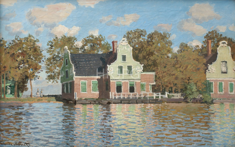
The visual logic of the painting is defined by the extraordinary symmetry between the houses and their reflections. Monet utilizes a sophisticated and restricted palette of cool greens, muted ochres, and pale blues to represent the Dutch atmosphere. The sky is a masterclass in tonal variation, with layers of soft, moisture-laden clouds that diffuse the light across the landscape. The houses are rendered as rhythmic, geometric forms that provide a strong structural framework for the composition. The river in the foreground is as smooth as glass, acting as a liquid mirror that doubles the visual data of the architecture. This 'mirror effect' creates a sense of profound stillness and natural order, reflecting Monet’s interest in the decorative patterns and flattened space of Japanese prints. He avoids hard lines, relying on the juxtaposition of color values to define depth.
Technically, Houses at the Bank of the River Zaan showcases Monet’s mastery of 'all-over' color harmony and tonal unity. He avoids traditional chiaroscuro, relying instead on subtle shifts in value to suggest depth and form. The brushwork is delicate and blended, capturing the tactile quality of the damp air and the transparency of the water. He avoids the use of black, using deep indigos and cool greens in the shadows to maintain a high-keyed luminosity. Historically, the Zaandam period was a major success for the young artist, and the works he produced there were highly sought after by collectors. Today, held in major collections such as the Museum of Fine Arts, Frankfurt, and the Metropolitan Museum of Art, the painting is admired for its lyrical beauty. It remains a vital document of Monet's early career, illustrating the bridge between his early outdoor observations and the visionary reflections of his later career.