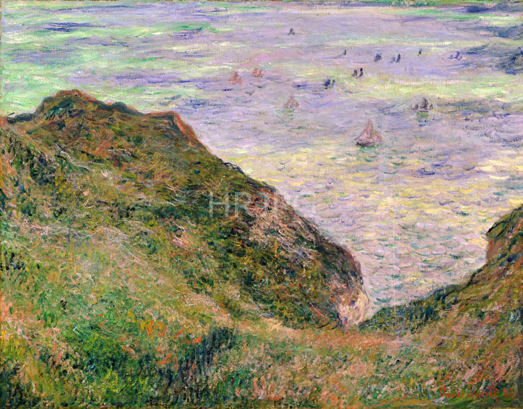
The visual composition is dominated by the horizontal bands of the sea, the wet shore, and the soaring limestone cliffs. Monet utilizes a high horizon line to emphasize the expansive foreground of the beach. The palette is sophisticated and airy, filled with pale blues, soft lavenders, and muted ochres. The wet sand is the true star of the work; Monet uses a complex range of colors to suggest its reflective surface, showing how it catches the soft pinks and violets of the sky. The small, rhythmic brushstrokes represent the ripples left by the retreating water, creating a vibrating surface that leads the eye into the depth of the composition. The distant cliffs are rendered with a soft, atmospheric touch, their forms simplified by the salt-laden mist of the English Channel. This focus on the 'envelope' of air unifies the scene, creating a sense of profound stillness and natural order.
Technically, Low Tide at Varengeville showcases Monet’s mastery of texture and light. He uses horizontal, fluid strokes for the sea and more textured, broken marks for the foreground sand and the rocky outcroppings. The shadows are not black or gray, but are composed of cool blues and deep greens, maintaining the painting's overall luminosity. He avoids hard outlines, relying on the juxtaposition of different color values to define the boundaries between land and sea. Historically, the paintings of 1882 were successful both critically and commercially, proving that the Impressionist method could handle subjects of monumental structure. Today, held in major collections like the Museo Thyssen-Bornemisza, it remains a beloved example of his coastal oeuvre, illustrating the perfect union between his revolutionary eye and the natural world he sought to record with such honesty and passion.